The 8s
Veri Peri – Pantone Colour of 2022
May, 2022
A new hue of blue
Veri Peri represents a period of transformation.
Sometimes it takes a great deal of ingenuity to get out of trouble. Credit science, for instance, which helped mitigate the deadly effects of the pandemic of late. It also helps to be creative, a trait that the Pantone Colour Institute holds to heart, resulting in the concoction of a totally original shade.
This blend of blue, violet, and red answers to catalogue number 17-3938, better known as Veri Peri. According to Pantone, the melded shade is a response to society finally moving from isolation to interaction. “Creating a new colour for the first time in the history of our Pantone Colour of the Year educational colour program reflects the global innovation and transformation taking place,” said Laurie Pressman, the company’s vice president.
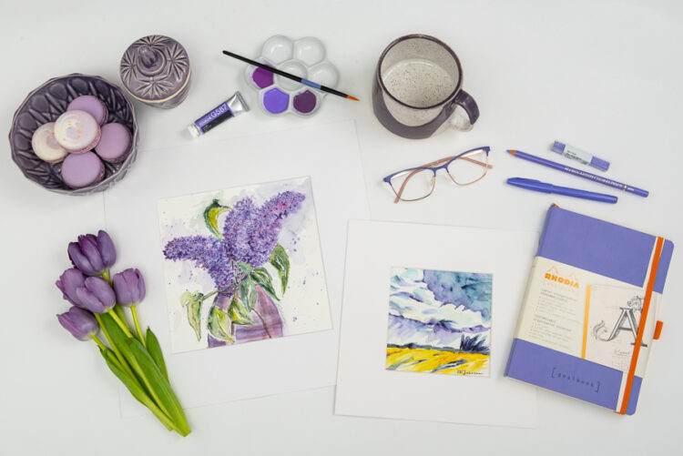
Pantone also revealed Veri Peri was inspired by digital art, particularly in gaming. Expect a few other products, including what’s in this visual spread, to pick up this baton.

- BOTTOM LEFT: Tulips $5 per bunch from Pearson’s Your Independent Grocer
- TOP CENTRE: Holbein Artist Gouache “Lilac” $13.75 and Ceramic Flower Palette $12.95 from The Paint Spot
- TOP RIGHT: Ceramic Mug $24 by JYJ Ceramics from the Art Gallery of St. Albert
- TOP LEFT: Ceramic Lidded Candle Jar $55, and Facetted Bowl $45 by JYJ Ceramics from the Art Gallery of St. Albert
- MIDDLE RIGHT: Eco “Maya” Dark Purple and Rose Gold Eye Glasses $156 from Sturgeon Vision Centre
- BOTTOM RIGHT: Holbein Artist Coloured Pencil “Wisteria” $5.10, Holbein Artist Oil Pastel “Blue Violet” $6.25, Pentel Colour Brush Sign Pen “Violet” $3.95, and Rhodia Goalbook $38.95 from The Paint Spot
- TOP LEFT: French Macarons $2 each from Whisk Bakeshop & Coffee House
- BOTTOM CENTRE: Lilac Sketch $110 and Storm Cloud Sketch $65 by Luise Mendler-Johnson


