The 8s
8 Tips for Minimalistic Design: Less is More - The principles of minimalistic design
December, 2015
Whether you’re talking armchairs or websites, the principles of minimalistic design are the same: do more with less; restraint yields greater impact; simplicity makes better design. If those are concepts that you could use more of, here’s a primer on achieving more with less.
8 Tips for Minimalistic Design
 A minimalistic design is stripped down to only its essential elements. So include what is necessary, and remove the rest. It’s like stating a clear message. Use as few words as possible, and mean them.
- Function comes first. When choosing design elements, think about their purpose at the most basic level (don’t ask them to multi-task). Then go for clean, straight, long lines. They too will emphasize the function of both the element and the room.
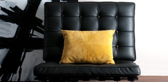
- Stick to a minimalistic colour story. What a monochromatic colour scheme lacks in flash, it makes up for in influence. So choose a dominant, neutral colour, and repeat it (or a slight variation of it) on all key pieces. The harmony it creates is calming, yet the design principle is exciting. A single accent colour is also part of a minimalistic colour story.
- Create a focal point, and let it have its moment. This could be an accent colour, artwork or even a spectacular view outside your window.
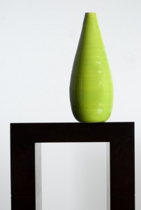
- Don’t be afraid of white space. When used properly, it will add to the elements that are there, not take away from them. Dark wood tones, for example, pop against light walls.
- Keep flat surfaces clear of clutter. One or two decorations are fine, but stacks of clutter and knick-knacks are not. Designate out-of-sight spots for things that would normally pile up, and put things away when they’re not being used.
- Let beautiful materials speak for themselves. When design is stripped down to its essential elements, details matter more and quality shows. So let metals shine, wood tones luster and simplicity speak.
- Edit. When you think you’ve got it right, remove something else. In fact, subtract until it breaks. When the overall effect stops working, go back to the step before it broke, and you’ve likely achieved the most minimalist design possible.


